Jun 17, 2025

Sidebars are the foundation of many digital interfaces — from admin dashboards to complex web applications. A well-designed sidebar is more than just navigation; it serves as a guide, a brand reinforcement, and a support for an intuitive user experience.
In this article, we’ll explore how to optimize sidebars from a UI perspective using a modern and functional approach.
1. Vertical Navigation
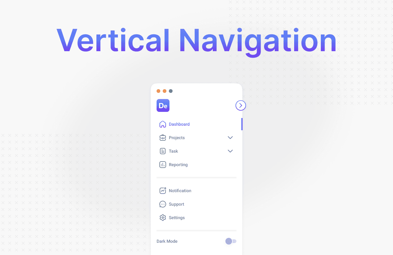
Sidebars are often positioned vertically because they follow the natural reading pattern of humans. With vertical navigation, we can utilize space efficiently, especially on wider screens like desktops.
Tips:
Use icons + labels to improve clarity.
Group items by category.
Add a clear active state indicator.
2. Deeper Pages
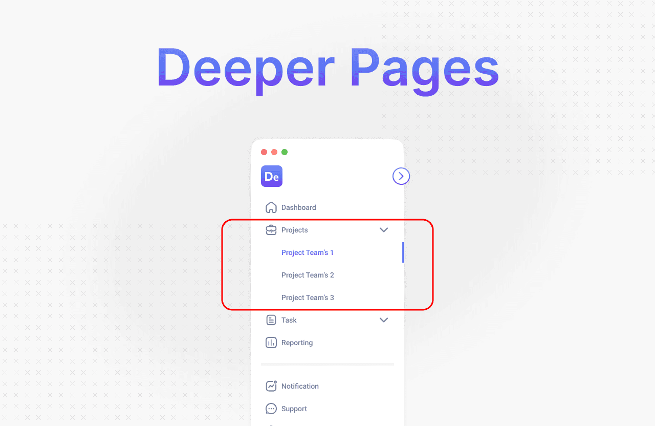
For applications with many pages or deep hierarchies, the sidebar should support nested navigation.
Solutions:
Use dropdown menus or expandable lists.
Display child pages only when the parent menu is active.
Avoid over-cluttering — limit the depth to a maximum of 2–3 levels.
3. Branding
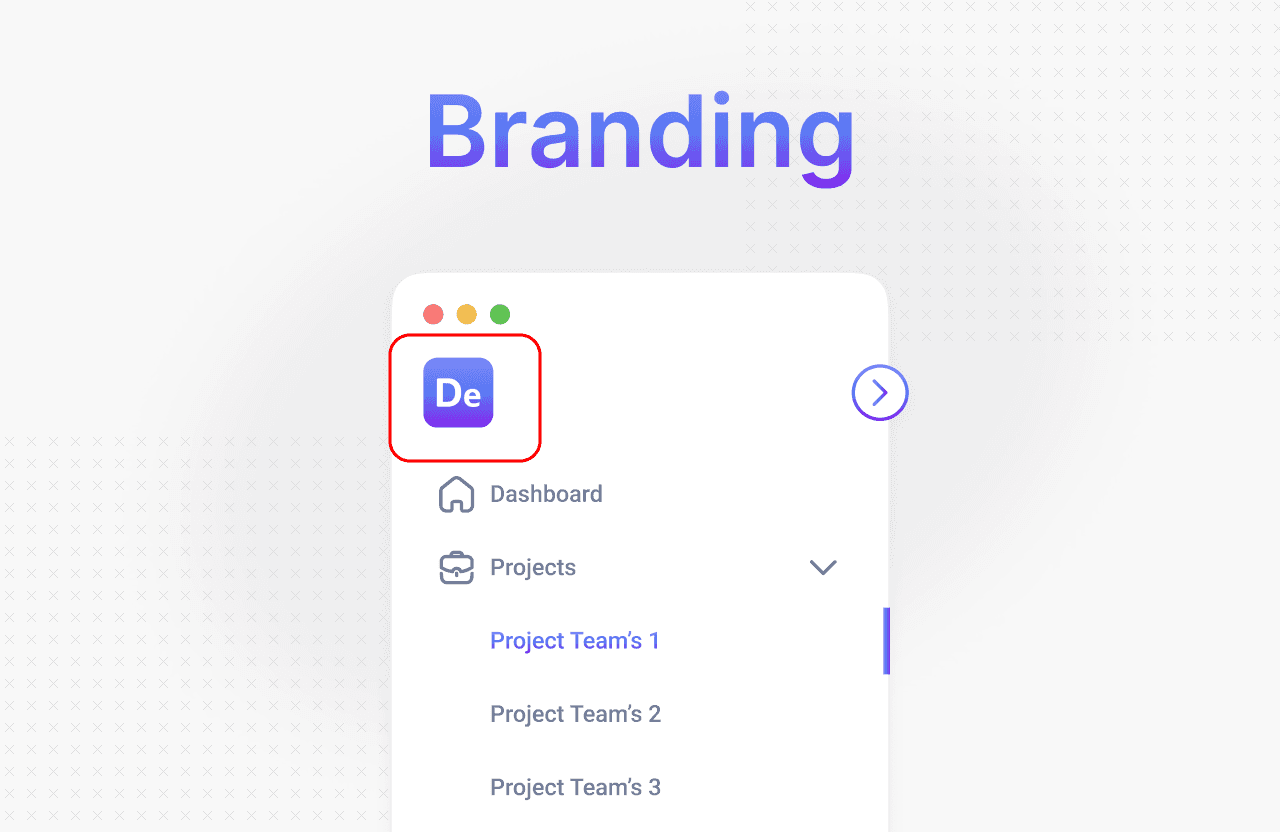
The sidebar is a strategic place to reinforce brand identity. Use the top area of the sidebar for a logo, tagline, or even interactive elements like account switching.
UI Considerations:
The logo should be clickable (typically linking to the dashboard or homepage).
Use colors and typography that are consistent with the brand style.
Avoid overly large logos — prioritize navigation functionality.
4. Compact and Collapsible
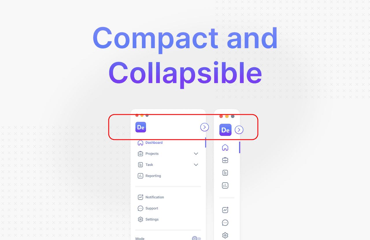
Not all users need the sidebar to be open at all times. A collapsible sidebar feature allows for a more compact view without sacrificing functionality.
Benefits:
More space for main content.
Ideal for focus mode or smaller screen devices.
Best Practices:
Show icons only when the sidebar is collapsed.
Provide a toggle button with a fixed (sticky) position.
5. Dark/Light Mode
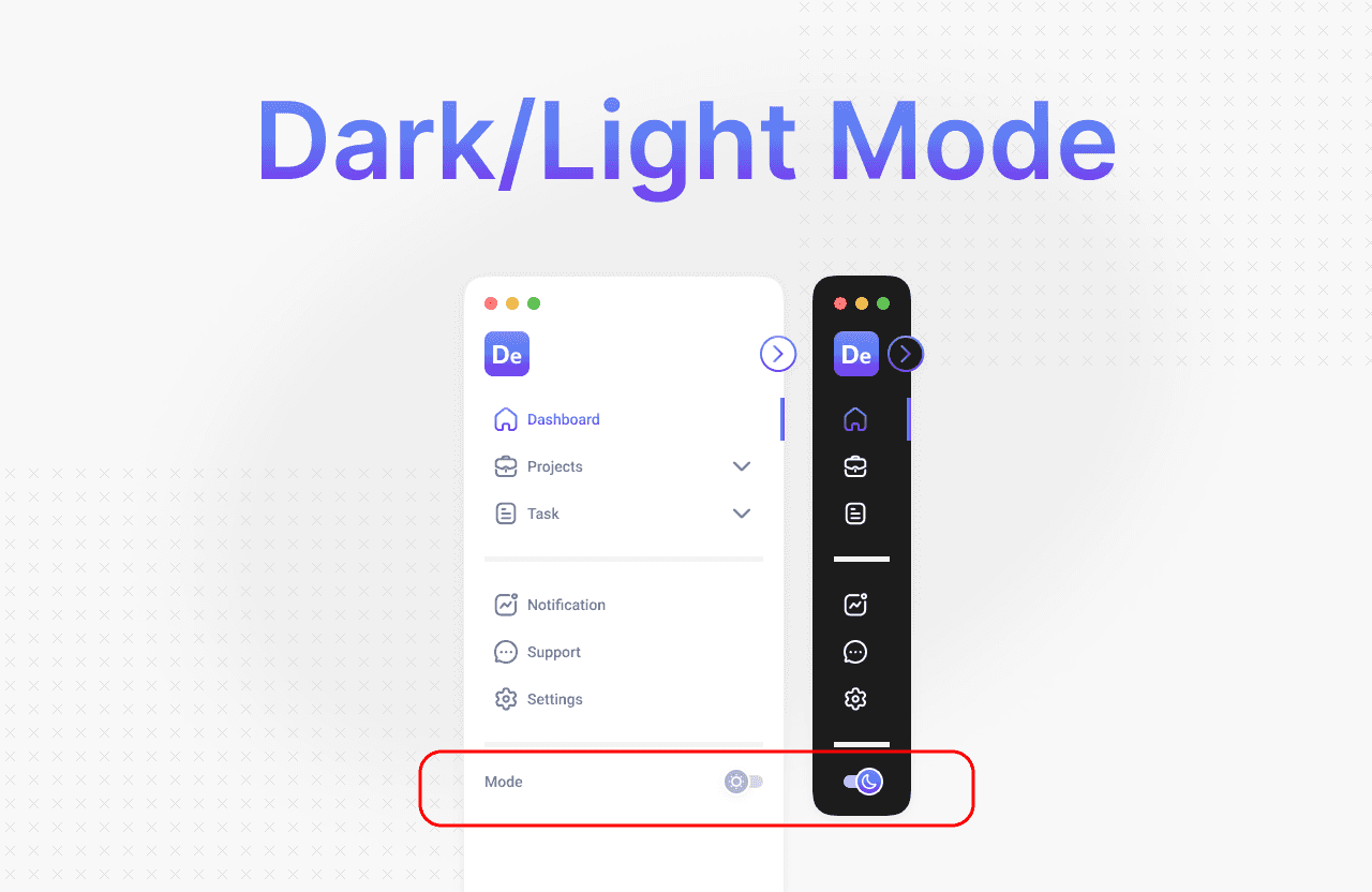
The sidebar should also support both dark and light modes to adapt to user preferences and lighting conditions.
UI Tips:
Use colors that are contrasting yet harmonious.
Avoid using overly bright colors for primary navigation.
Ensure icons and text remain legible in both modes.
6. CTA (Call to Action)
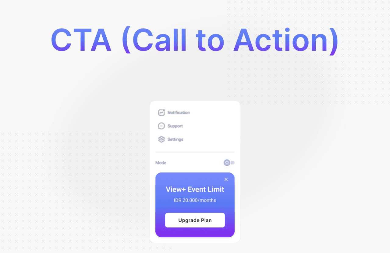
A sidebar is more than just navigation — it can drive action. Place strategic CTAs at the bottom or in areas that don’t interfere with navigation.
Example CTAs:
“Upgrade Plan”
“Invite Team”
“Try New Feature”
Note:
Use color or visual elements to differentiate CTAs from regular navigation items.
Ensure CTAs are consistent across pages, but not overly distracting.
Save user preferences (e.g., via localStorage).


